Time for a CDC “flu data” check in
https://www.cdc.gov/flu/weekly/index.htm
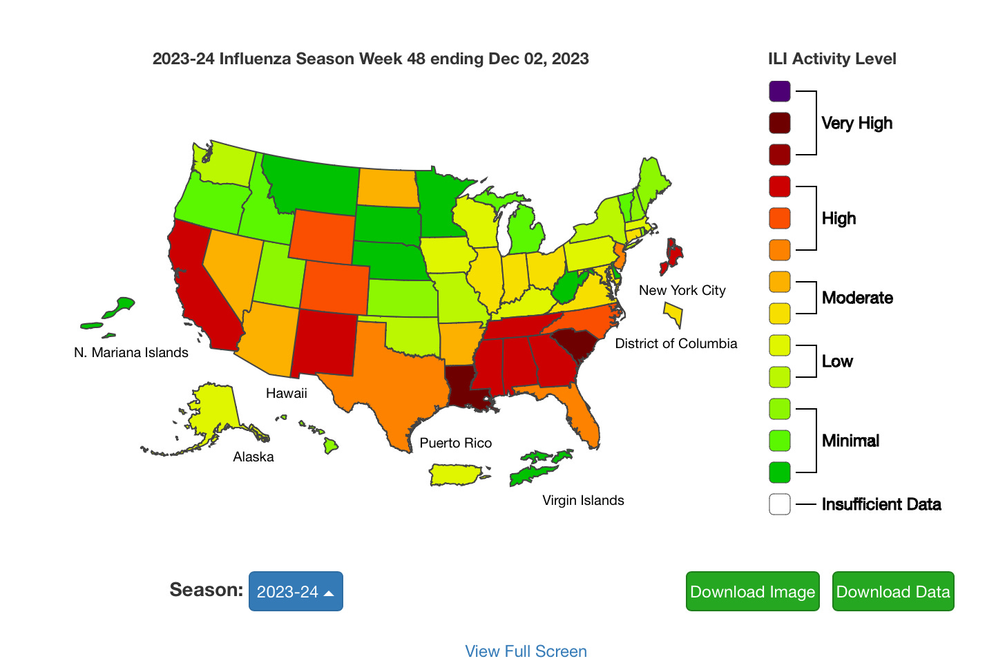
Time for a pretty little color coded update from CDC “Fluwise” land.
Oh we still have scary colors in Louisiana. And I decided to have a look at Tennessee as well in the “high” category. Be prepared to laugh and shake your head.
So good ol Louisiana. They still have yet to publish how many people they actually test. They have switched up their color coding of each reporting agency that matches NOTHING to the color coding of the CDC. Have a look:
What exactly do these colors mean? It says you can click on each Parish for “more data” but as of the typing of this post, you cannot click on anything. These color codes are nothing like the color coding a few weeks ago. Did they just decide to make the map pretty?
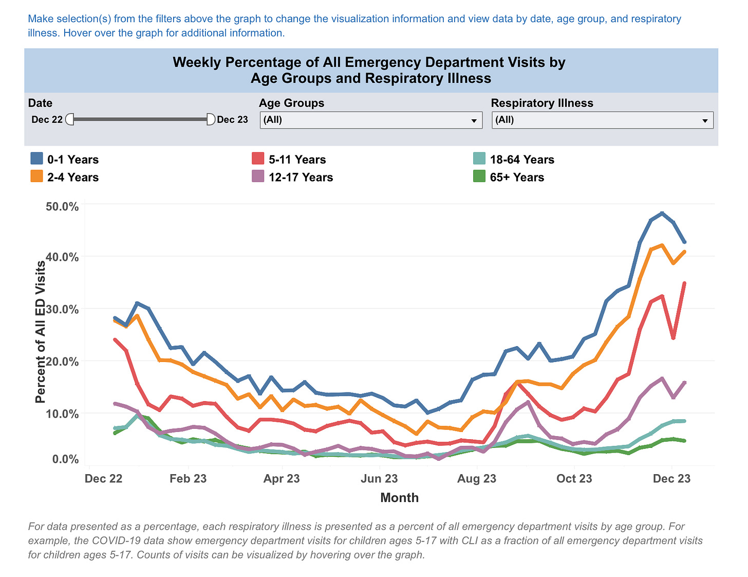
So here is their “percentage” breakdown, but yet again percentage of WHAT? They do not tell you anything about how many people came in for any kind of respiratory illness. Just the “percentage”. Which has zero value if you do not know the total number of visits and what the percentage of illness is. *eyeroll*. Also, notice that the “scary percentage numbers” are all kids age 12 and under. The highest is babies age 1 and under. Adults over age 18 are at maybe 5%? But again, we do not know what the total number of people in each age group is, so this graph is hot garbage.
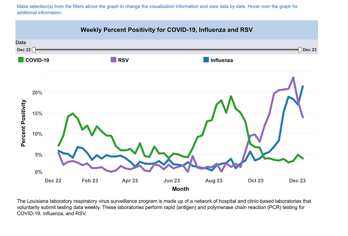
Here is another fun Louisiana graph:
Notice that RIGHT when “covid” dropped, RSV and Flu started to rise. Hmmm. Interesting. But alas, what is the percentage of people cruising in for testing? We DO NOT KNOW. These tables mean NOTHING if you don’t include the data. Such as, we had 1,000 people come in with respiratory illness, and 200 tested positive for RSV. Or we had 10 people come in for RSV and 2 tested positive for it. Percentage means jack squat without the rest of the data.
OK so time to pick on Tennessee. I chose Tennessee because I love that state. It is some beautiful country, and as a Harley rider, it is just damn fun to ride there. So the CDC says “oohhhh scary map, Tennessee is in the RED!” HIGH respiratory illness is RAMPANT in Tennessee!!! Buttttttttttt………check out what the Tennessee health department has to say:
Uhm, what? Everywhere is in minimal to moderate? And let’s be real, those percentages also have no data behind them but we consider 5% of people testing positive for flu/covid/RSV as “moderate” illness areas? Seriously? That means 95% of people did NOT test positive or come into the clinic for an ILI. And they consider 10% as the cut off before it is “very high”? Again…….that would mean 90% of clinic visits are for anything NOT ILI. But alas, again, no percentage numbers given so we have no clue what these are percentages of. 100? 1,000? Who knows. But Tennessee state data does not = the scary Red Zone that the CDC website has tagged it with.
Look at what fun data does pop up on page 3 of their weekly data and wait til you see this!
LMAO look at this. 186 tested specimens, with 6 people testing for Flu A and 3 people testing for Flu B. THAT is what equals to 4.8% to earn a moderate rating and a CDC red flag warning? You have GOT to be kidding me.
I cannot. I just cannot. The lies and manipulation.


They’re incapable of being honest, they’ve been lying to the public for so long, way before covid, that it wouldn’t occur to them to be honest now. All those alphabet agencies are completely corrupt, big pharma puppets, pathetic.
Either they are lying or their vaccines don't work...