Updated Excess Mortality Report and VAERS
Now that we are past the 1st quarter of the year, it is time to check in on what our excess mortality is looking like for 2022.
Green line= 2020
Blue line= 2021
Maroon line= 2022
This first graph is all age excess mortality. https://www.usmortality.com/excess-absolute
What we see here, so far, is excess mortality continues to trend higher among all ages. So far, excess death is up 16% compared to a year ago. We started the year in negative territory, but as the year progressed, excess deaths have risen again. We went above the 2021 excess death threshold the end of January, 2022. So far, this year, we have had 129,513 more deaths to date than expected across ALL ages.
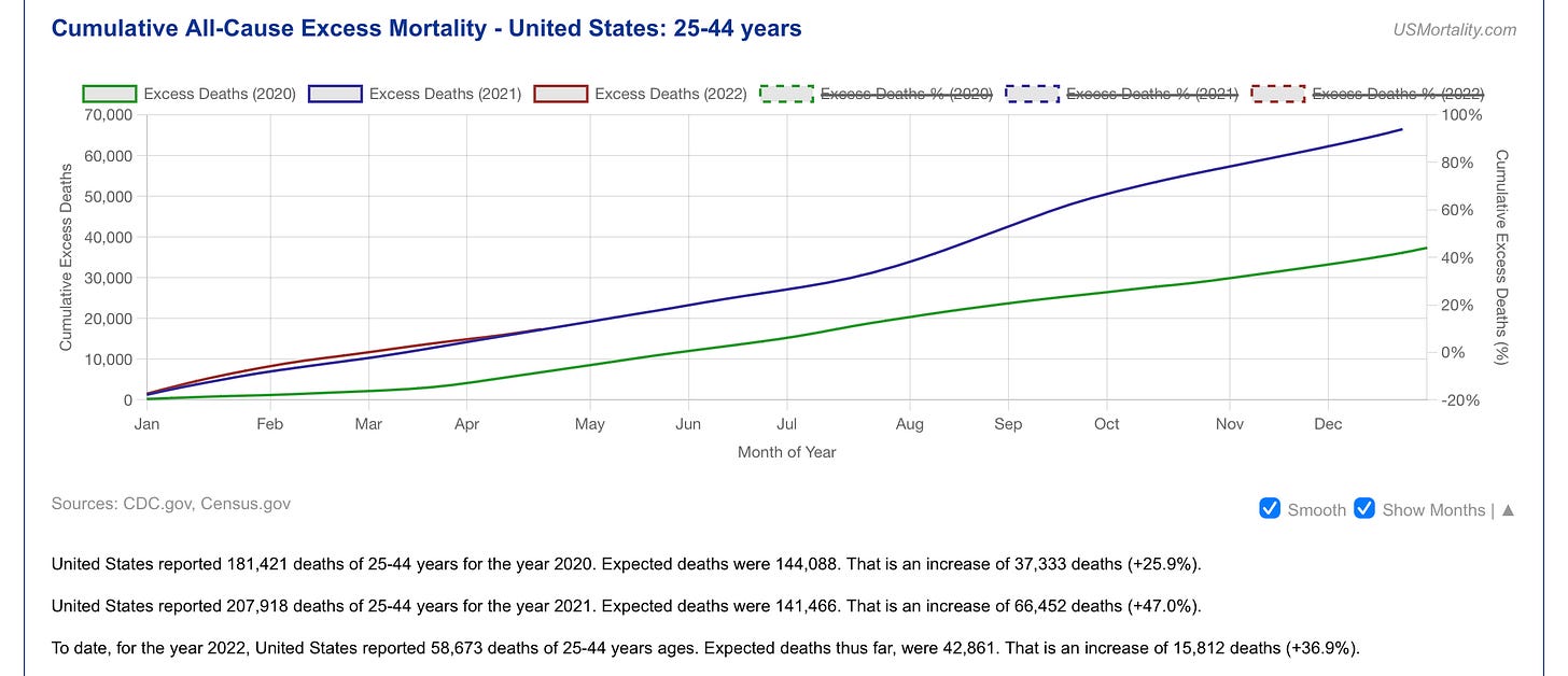
Now we have the age 25-44 group
This one is an interesting one to watch. So far this year, there is a 36% increase in excess death compared to a year ago. We have a surplus of 15,000+ deaths in this age group. The reason I watch this one so closely is that this is normally your healthiest, lowest risk of death age group we have. This population is the healthy worker bees that generally do not die in excess. One interesting trend here, is that the maroon line has started to nudge closer to the 2021 excess death line as the year progresses. It will be interesting to see where this ventures to in the next quarter. Will excess deaths level off? Drop? Or increase?
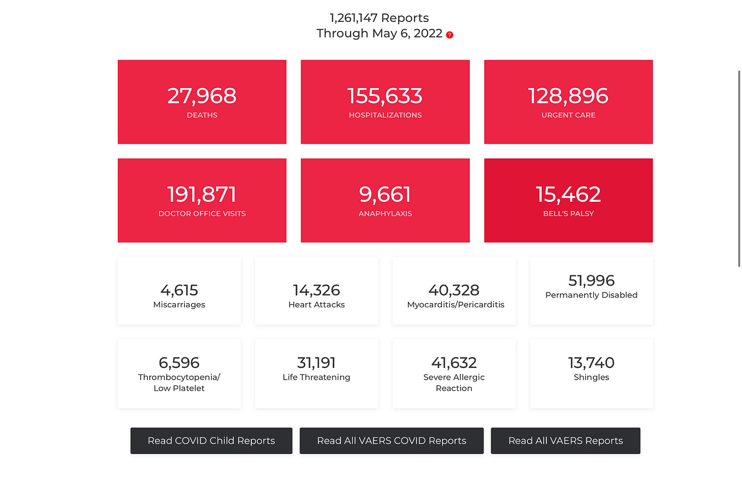
Current state of the VAERS report: https://openvaers.com/covid-data


And nobody is talking about this, 36% is fucking huge, why isn't this ALL OVER THE NEWS?!?!