Time for an Ethical Skeptic update on excess death
We will lead off with this:
While the deaths from SADS is staggering at 39,000…….look at the contrast in average age at death from covid (82) versus the age of SADS and “abnormal clinical and lab findings” mortality being 49.
Then we have this:
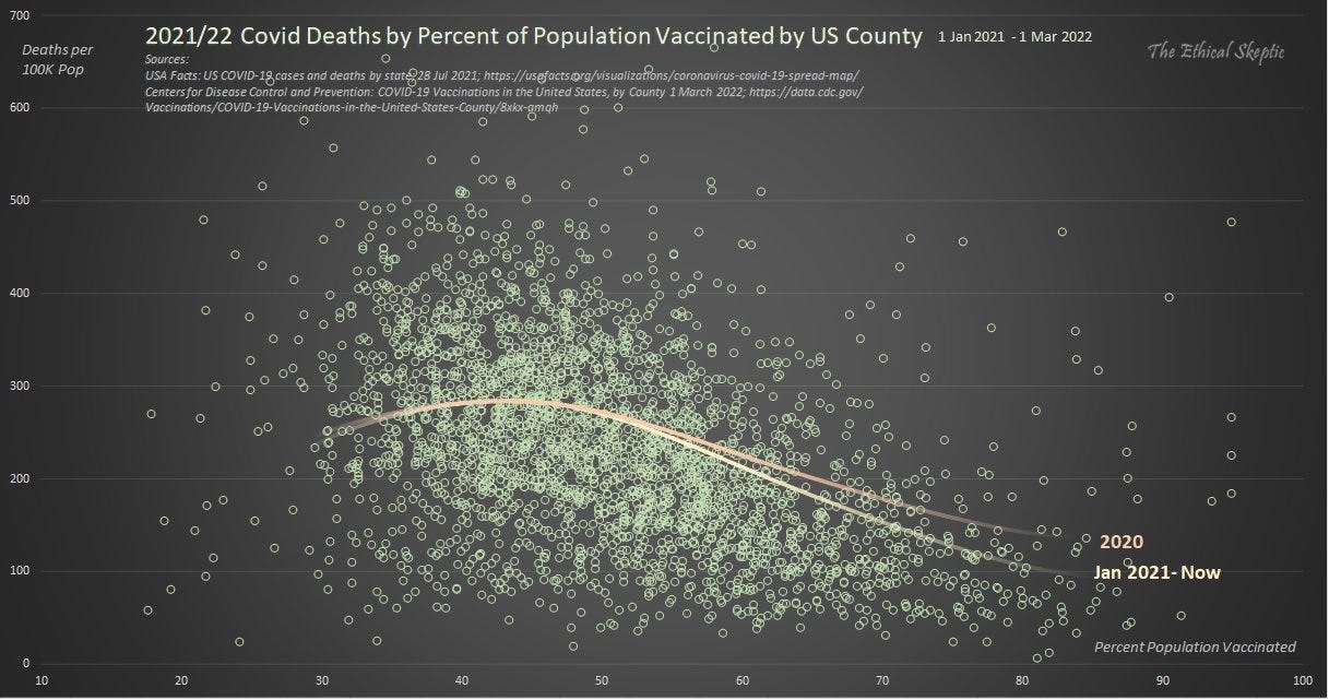
This shows deaths per county from covid. Dating back to the curve of 2020, and the bottom curve is vaccinated people who have died of covid. Notice there is not much difference, especially at the height of vaccine use. Orange curve line is pre-vaccine. Yellow curve line is post vaccine deployment. The green dots represent the number of deaths per county, with an average vaccination rate between 40-60%. So we can hypothesize that overall, in the statistically significant portion of vaccinated versus not vaccinated, deaths from covid were the same among the 30-55% who were vaccinated as they were prior to vaccines. Notice very few to no deaths below the 15% vaccinated line. It begins to pick up at 20% vaccinated, and is still elevated at the 95% vaccinated mark. Applying a true bell curve to this would make sense given the average vaccine uptake was somewhere in the 40-60% across the board, with pockets of 90%+ vaccinated and pockets of very few vaccinated. The scatter chart applies well to the average vaccine uptake. Interesting that the vaccines did not deter death any better than prior to vaccine availability.
Aaaaaaand, then we have this:
Here we look at “non-covid” deaths. THe solid green line shows non covid excess death post vaccine roll out. The dotted line at the bottom? That is excess non-covid deaths PRIOR to mass vaccine roll out. MASSIVE change in excess deaths NOT related to covid after the vaccine roll out. He deduced a 77% rate of excess deaths and rate of vaccination.
“The cure cannot be more dangerous than the disease”. That is the oath we are to live by. I think the above example shows that we set that dumpster on fire 18 months ago.


All & every time pointing to GENOCIDE.
We see this everywhere we look for it! (Like covid!)