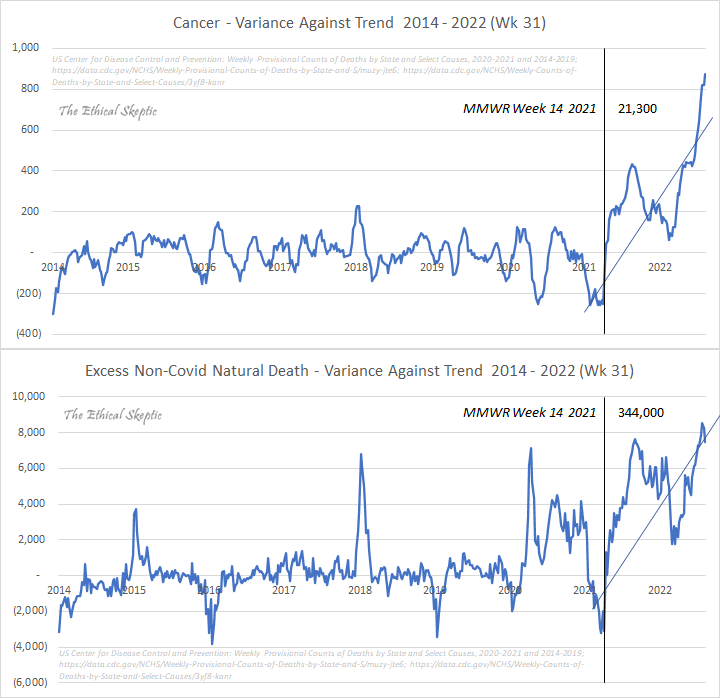
The increase in cancer and non-covid deaths after covid vaccines were introduced, and the CDC/Excess Mortality data worker bees are trying to hide it and cover it up.
I have mentioned the Ethical Skeptic many times in previous posts. They have been THE MOST astute observer of CDC data pertaining to mortality and the ICD codes associated with death since the pandemic started. He was tracking the data daily/weekly……UNTIL the CDC started to monkey with the data. In an effort to cover up what was being reported TO the CDC, they did a “system upgrade” in May/June 2022, deleted 20,000 + cases, reassigned some cases to a new ICD code, etc. So the CDC website and the excess mortality website that many of us like to watch closely are no longer statistically accurate. They have been fudged with, manipulated, all in an effort to keep the people reporting the data from having accurate data to disseminate. It also makes it appear to the general public that the covid vaccines have not been as deadly as they are.
The Ethical Skeptic never gave up though. They have continued to track the data, reports the discrepancies, and knows the EXACT number of cases that the CDC has manipulated in their favor. They are a brilliant statistician. He tracked the exact case count of what the CDC made “disappear” and what they reassigned to a new ICD code to make it appear less nefarious:
Re-homed means they got a new category to be counted in. Re-homed and re-assigned means that a previously recorded death marked under cardiovascular or cancer death now has a new home under something more “off the radar” like natural causes, etc. The CDC KNOWS that people like the Ethical Skeptic are watching ICD death codes, so if you want to throw them OFF the trail, you gotta code deaths differently. They thought they outsmarted people, but they did not. Here is another post by Ethical Skeptic that shows you primarily where those previous myocarditis/pericarditis/cancer deaths were re-assigned to:
Moving along…….
Here is a great example of where the CDC tried to derail the statistics train. This is cancer death and non-covid deaths dating back to 2014. The long black line across the graph is when covid vaccines were introduced to the general public. Look at the death reports after that black line. Dear lord, it is horrible. Also note, mid 2022, there is a sudden DROP in the graph. What was that drop? That was when the CDC started changing data to cover up the mass deaths occurring. The problem is, deaths are increasing so rapidly, that their little “fudging” was not nearly enough to contain the problem. You cannot temporarily lie about numbers when the problem keeps increasing.
They cannot hide/lie/cover-up what they did here with lying about the data, nor can they outsmart the people who follow this data professionally each week.
We have all been lied to. Period.


Does his graph includes those “moved along” numbers? Thanks
Can we hang them all now?
Pleeeease?