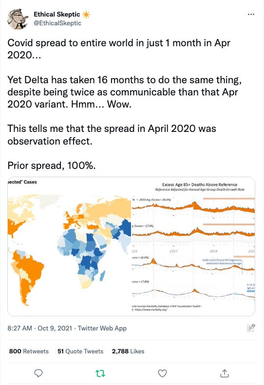
“Covid” has been here much longer than they want us to believe, and we have an odd excess death increase in 2017-2018 that matches up to when omicron was originally released.
A few months ago, I shared a genetic tree of the covid variants. That analysis showed that Omicron is actually a genetic grandparent of alpha and delta, not a child/subsequent variant created/evolved AFTER delta and alpha. I am re-posting those photos below as a refresher from that post.
This photo above by the ethical skeptic outlines how old Omicron actually is. 2017-2018.
And this photo from ethical skeptic that discusses Omicron is PRE Wuhan, delta, alpha, beta variants.
So now on to new data that builds on this:
Back in October 2021, ethical skeptic hypothesized that the spread of covid occurred much slower than we were led to believe in March 2020, when the spread of alpha appeared to be very fast and rapid. Remember how quickly NYC was “invaded” and people died in rapid succession? Well, that wasn’t a sudden burst of covid. It had already been spreading for some time. We witnessed the PEAK, not the RISE. Much like we watched Delta peak in late 2021, but it had been spreading for several months?
Take this graph from NPR for example.
Look at the SHARP RISE in deaths in April 2020. Are we supposed to believe that covid just magically arrived in March 2020 and caused THAT MUCH DEATH in a month span of time? Whereas, when you look at the other death peaks, they went on for months at a time? This matches up to ethical skeptics genetic analysis above that Delta actually arrived in fall 2020, NOT summer 2021. It was by far the deadliest variant, and look at the peaks of death correlated to not only flu season, but how spread out the peaks are? November 2020-March 2021, then again in August 2021-December 2021. The spring 2022 death peak is attributed to mostly delta carry-over with some omicron mixed in. You can see by April 2022 that the death rate leveled off to the lowest level it ever has during covid, yet we are seeing multiple omicron cases continue marching across the country.
The data does not support that the Wuhan strain arrived en-masse in March 2020. It had been here much much longer. Anecdotally, we all know people in our personal lives who were really sick in the fall of 2019 with what we speculate was covid. I did another post that correlated the June 2019-January 2020 outbreak of EVALI, the vaping lung disease, as actual covid not EVALI. Because EVALI magically disappeared when covid “arrived” in winter 2020. Other articles have reported they found Sars COV-2 in blood samples dating back to 2019. Some fringe articles even discuss finding Sard COV-2 in specimens back in 2018.
Further support for this hypothesis?
This is an all cause mortality chart dating back 10+ years. Zoom in and notice something interesting happened during flu-season 2017-2018. There was an abnormal spike in the all cause mortality (where the black arrow is pointing). Based on the genetic lineage of Omicron dating back to 2017-2018, it is HYPOTHESIZED that covid was actually originally leaked during the 2017-2018 flu season. Which would explain why its genetically a grandparent to the 2020 and forward variants (it was 3 years older), and would also explain why it has been less virulent towards humans, as many of them were exposed TO IT back in 2017-2018. If you remember back, that years flu season was particularly nasty with upper respiratory illnesses and influenza cases.
Aside from ethical skeptic, I highly recommend following the professor here. He provided much of the data in this post as well.
Hypothetical speak here: covid was introduced back in 2017 as the omicron variant. And has been spreading globally since. Wuhan strain had been circulating for many months before we declared we had a pandemic going on. It just escalated into lockdown and full defcon panic in March 2020.


The 10 year all cause mortality graph trajectory shown is interesting...seems to back up the graph of deaths of flu versus number of flu shots given- no improvement- Unless of course, improvement equals you want more people to die?🤔