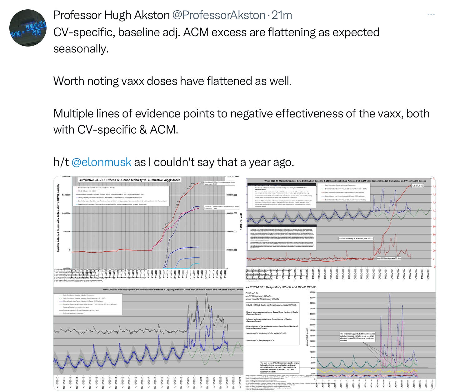
Today is a hodge-podge of some interesting data tables.
First off, we start with Professor Akston:
I want to focus on one of his charts specifically:
This is data from 2015 to present. The pink line is when covid is listed on the death certificate as the cause of death. Note a few important things: since March 2022, covid as the cause of death is the same as other chronic lower respiratory cause of death. The second thing I want to note here is the blue line that peaks and ebbs with the pink covid cause of death line. That is the non covid respiratory causes of death. Notice something about that line? It peaks much higher than covid deaths did at EVERY peak, and it never drops as low as covid cause of death did. And since March 2022, it continues to be elevated significantly higher than covid cause of death which has gone below 4,000 for over a year.
Next up is a great data table by Dr. Jessica Rose. You can read the entire article on her Substack page.
This data table is important. The narrative that is frequently shared is “well yeah, more deaths occurred because we gave more covid vaccines out so there is more covid vaccinated people and duh, they die, but it isn’t because of the vaccine so stop spreading misinformation”. So Dr. Rose took that data and extrapolated it into this table. The red lines are deaths per million doses, and the blue line is the millions of doses given. Look across the board. Lets start with the “shut up misinformation” groups favorite one first. Look at the millions of doses of flu vaccines given, versus the tiny small amount of people who died per million. 0.35 deaths per million doses. Very tiny. Now go over to the covid vaccine. Not only are covid vaccine deaths at 23.70 per million doses, but the death per million FAR exceeds the number of vaccines given. What’s that? A little louder for those in the back? Way more flu shots were given than covid shots??? With death counts off the charts???? Huh. Who would have guessed? 🙄
Also note on this chart the deaths per million are higher than administered vaccines in the DT, DtAP-HepB, the HepB-HIB, the DTaP-IPV-HIB, the HIB alone, the HPV vaccine, the Rotavirus, and the Tetanus shots. As discussed before, this is way deeper than just a covid vaccine problem.
And the final table of the day: Birth rates in Germany. I do not have a link for this, I took a screen shot and thought I had the article saved in my browser and I did not. Sorry friends.
We can see the overall data for 2022 birth rates was much lower than 2020-2021. But wow look at 2023. It is still listed as provisional data, but so far this is not good.


Thank you for these charts. I’ve saved the Jessica Rose chart for future discussions with vaxxes. BTW it’s doses distributed not administered, I believe she said in her article. The German birth data is scary...
Thank you Jennifer. We are in the middle of a eugenics program. May there be peace on earth. :-)