A new update from Ethical Skeptic on excess cancer death, 20 sigma increase in cardiac deaths, and other interesting tidbits
Ethical Skeptic has been busy this week! I love his work. It is raw, unbiased, and he knows his stuff. Wanted to share the gems of the week he has posted regarding excess mortality, cancer deaths, etc.
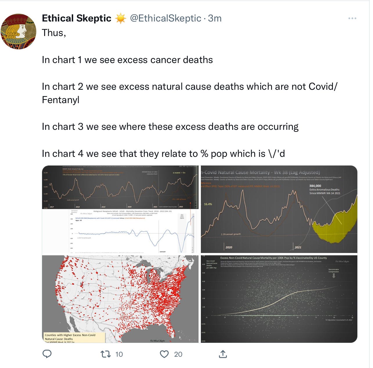
Chart 2 is a real hum-dinger. We are up 384,000 excess deaths. The yellow zone shows the area between where we SHOULD be at the bottom and where we ACTUALLY are at the top of excess deaths. Also notice the chart 3 red dots which show heavy concentration of excess deaths in areas where vaccine uptake was higher (primarily blue states).
Here is more analysis on the graph 4: The dotted line represents the data of deaths that has not been manipulated or changed by the “higher ups”.
So what is a sigma? It relates to standard deviations. The range of numbers. Ideally you want a sigma to be low, because that means the difference between two points on a line are close together. Such as, look at the line from 2018-early 2020. The line is pretty horizontal with little variation. That would be a low sigma with a normal standard deviation. Now go over to the right side and follow his gray line from the beginning of 2021 to present. The difference between THOSE data points is waaaaaay out of normal standard deviation. For the record, anything out of a standard deviation of 3 is generally considered a massive anomaly. So a sigma of 20?? That is basically unheard of. Beyond rare. Also remember that the gray area where these cardiac deaths drop off was the time period when the CDC quit reporting these ICD codes due to a “system upgrade”, so that downward plunge was created via manipulation. The cardiac deaths have been rising this entire time. Sigma 20………there really are no words for the absolute statistical anomaly that this truly is. No statistician would ever believe this number if it wasn’t plotted out in black and white. Mindblowing.
Moving on……to overall excess deaths in Europe and US:
And another fun data point from Seamus on Twitter:
Weekly data on Australian covid hospitalizations as they pertain to vaccine status.
ZERO UNVACCINATED HOSPITALIZED PATIENTS. But wowsers, have a look at the 4+ vaccine group. THey make up the largest group of hospitalized with covid. The 3 dose group is the largest group in the ICU. 25 deaths among the 1-4+ vaccinated, compared to 2 deaths among the non-vaccinated.
Pandemic of the vaccinated my friends. If we are threatened with a “long winter of death” again, it won’t be for the unvaccinated people. It will be the vaccinated at the highest risk. We are one year away from the “injection” overtaking total covid mortality. Per his estimates based on his data. Remember, we are already at 384,000 excess deaths right now. Imagine what this winter will be like.
And a final share from ES.
I like his breakdown of variants, and in the top right corner his current “level of concern” for vaccinated versus unvaccinated. The top line shows little concern for the unvaccinated. The second line shows that vaccinated are creeping into middle risk territory, they had been lower risk the past few weeks. This graph also shows what I suspected with the Walgreens data back in September: the omicron booster variants are being eaten alive by new variants. While I thought 4.6 would be the primary “overtaker”, we now see BQ 1.1, BQ 1, and BF 7 enter the landscape. No. The omicron booster has zero coverage for those.
Here is the end of the month of October Walgreens variant data: BA 5 and 4 continue to drop, and the BA 4.6 is creeping up with the BF, BE, and BQ Variants.


5G rollout map sure looks similar to the excess death occurrence map.
Yeah, I get 5G is where the densest population centers are, and the most vaxxed densities as well, but...
The data continues to pile up! Spoiler alert: More is coming! :)